SVG Controls
These are WPF controls for directly viewing the SVG documents in the WPF applications. The class diagrams are shown below:
classDiagram
    direction RL
    class Viewbox
    class Canvas
    Canvas <|-- SvgDrawingCanvas
    Viewbox <|-- SvgViewbox
    SvgViewbox *-- SvgDrawingCanvas
    SvgDrawingCanvas <|-- SvgCanvas
    IUriContext <|-- SvgCanvas
    IUriContext <|-- SvgViewbox
    class IUriContext {
      <<interface>>
      +Uri BaseUri
    }
    class SvgDrawingCanvas{
      +string AppTitle
      +bool DesignMode
      +Rect Bounds
      +Transform DisplayTransform
      +Point DisplayOffset
      +DrawingVisual HostVisual
      +SvgInteractiveModes InteractiveMode
      #int VisualChildrenCount
      +LoadDiagrams(string) void
      +UnloadDiagrams() void
      +RenderDiagrams(DrawingGroup) void
    }
    class SvgCanvas{
      +string AppName
      +Uri Source
      +Uri UriSource
      +string SvgSource
      +Stream StreamSource
      +bool AutoSize
      +bool OptimizePath
      +bool TextAsGeometry
      +bool IncludeRuntime
      +CultureInfo CultureInfo
      +bool IgnoreRootViewbox
      +bool EnsureViewboxSize
      +bool EnsureViewboxPosition
      +DrawingGroup Drawings
      +FontFamily MessageFontFamily
      +double MessageFontSize
      +double MessageOpacity
      +string MessageText
      +Brush MessageBackground
      +Brush MessageFillBrush
      +Brush MessageStrokeBrush
      +Load(Uri, bool) bool
      +Load(string, bool) bool
      +Load(Stream, bool, bool) bool
      +LoadAsync(Uri) Task~bool~
      +LoadAsync(string) Task~bool~
      +LoadAsync(Stream, bool) Task~bool~
      +Unload(bool, string) void
    }
    class SvgViewbox{
      +string AppName
      +Uri Source
      +Uri UriSource
      +string SvgSource
      +Stream StreamSource
      +bool AutoSize
      +bool OptimizePath
      +bool TextAsGeometry
      +bool IncludeRuntime
      +CultureInfo CultureInfo
      +bool IgnoreRootViewbox
      +bool EnsureViewboxSize
      +bool EnsureViewboxPosition
      +DrawingGroup Drawings
      +FontFamily MessageFontFamily
      +double MessageFontSize
      +double MessageOpacity
      +string MessageText
      +Brush MessageBackground
      +Brush MessageFillBrush
      +Brush MessageStrokeBrush
      +Load(Uri, bool) bool
      +Load(string, bool) bool
      +Load(Stream, bool, bool) bool
      +LoadAsync(Uri) Task~bool~
      +LoadAsync(string) Task~bool~
      +LoadAsync(Stream, bool) Task~bool~
      +Unload(bool, string) void
    }
Common Drawing Control - SvgDrawingCanvas
The SvgDrawingCanvas control is a generic canvas that extends the WPF Canvas control to provide rendering of drawing objects or DrawingGroup created from SVG documents.
- The SvgDrawingCanvas is specialized for rendering drawings generated by SharpVectors and therefore is not useful for rendering other WPF drawings. The SvgDrawingCanvas.RenderDiagrams method takes the WPF drawing generated from the conversion of SVG documents and renders it for viewing.
- The SvgDrawingCanvas itself does not handle the processing or conversion of SVG documents to WPF drawings. It is generic, allowing serialized XAML format of generated drawings to be reloaded or deserialized and rendered by the SvgDrawingCanvas class. The SvgDrawingCanvas.LoadDiagrams method takes a serialized XAML file, deserializes it to the corresponding WPF drawing, and renders it.
- The SvgCanvas and SvgViewbox controls extend and embed SvgDrawingCanvas respectively. These controls handle the conversion of SVG documents to WPF drawings and use the SvgDrawingCanvas to render them.
- Controls deriving from the SvgDrawingCanvas class instead of the WPF Canvas control will support interactivity when added in future releases of the drawing canvas.
Common Drawing Properties
The SVG drawing controls that extend or embed the SvgDrawingCanvas control have similar properties. In this section, we discuss these common properties to simplify documentation and avoid repetition.
SVG Document Sources
These are WPF dependency properties and therefore support data binding.
- UriSource or Source: This property (type: Uri) provides access to SVG documents in the form of local files, assembly resource files (Pack URIs), and remote files (supporting HTTP and HTTPS protocols; FTP protocol is not supported). The Source property is the original name and may be removed in the future.
- StreamSource: This property (type: Stream) provides SVG documents through .NET Stream objects, which are a generic view of a sequence of bytes. It allows access to local documents, assembly resource documents, memory documents, network documents, or basically any SVG document source where a .NET Stream instance is available.
Note
The SVG controls take ownership of the stream since it is stored as dependency property. Therefore, a copy of the specified stream is created and kept in memory. If you do not desire a copy of the specified stream to be created, use the available load method that provides an option to skip the copy process.
- SvgSource: This property (type: String) provides SVG documents as plain text. This is provided for cases where SVG content is desired as part of the XAML content.
SVG Settings or Options
The SVG controls convert SVG documents to WPF drawings and control the conversion settings or options (WpfDrawingSettings). Therefore, the controls expose these settings as properties for customization. The current available settings are shown below:
- WpfDrawingSettings.OptimizePath: This property (type: Boolean) indicates whether the path geometry is optimized using StreamGeometry.
- WpfDrawingSettings.TextAsGeometry: This property (type: Boolean) indicates whether text elements are rendered as path geometry.
- WpfDrawingSettings.IncludeRuntime: This property (type: Boolean) indicates whether to include SharpVectors-specific markup extensions in the generated WPF objects.
- WpfDrawingSettings.IgnoreRootViewbox: This property (type: Boolean) indicates whether to disable the viewbox at the root of the drawing.
- WpfDrawingSettings.EnsureViewboxSize: This property (type: Boolean) indicates whether to preserve the original viewbox size when saving images.
- WpfDrawingSettings.EnsureViewboxPosition: This property (type: Boolean) indicates whether to apply a translate transform to the viewbox to ensure it is visible when rendered.
SVG Progress Message Options
Loading and rendering large SVG documents can take several seconds to a few minutes. The SVG controls provide a means to display a progress message to the user indicating a long-running operation. The progress message text and styling are controlled by the following properties:
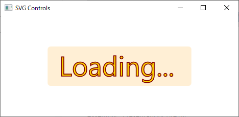
- MessageFontFamily: This property (type: FontFamily) specifies the font family used to render the progress message text. The default text is
Loading.... - MessageFontSize: This property (type: Double) specifies the size of the font used to render the progress message text.
- MessageOpacity: This property (type: Double) specifies the opacity of the progress message.
- MessageText: This property (type: String) specifies the text of the progress message.
- MessageBackground: This property (type: Brush) specifies the background brush of the progress message text.
- MessageFillBrush: This property (type: Brush) specifies the fill brush of the progress message text.
- MessageStrokeBrush: This property (type: Brush) specifies the stroke brush of the progress message text.
The default progress message text and styling are shown below:
Canvas Control - SvgCanvas
The WPF Canvas defines an area within which you can explicitly position child elements using coordinates relative to the Canvas area. The SvgCanvas control is a WPF Canvas-derived control for viewing SVG files in WPF applications. It lets you use all the known features and behavior of WPF canvas controls. In particular, it extends the SvgDrawingCanvas control and uses it to render any converted SVG drawing.
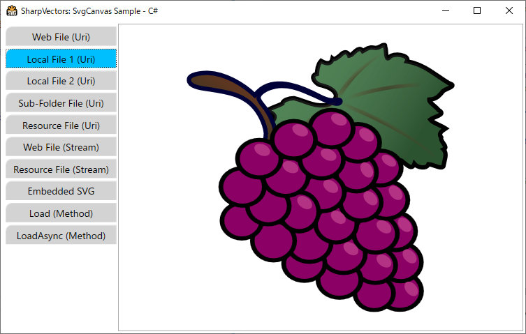
The following XAML code from the SvgCanvasSample sample illustrates the usage of the SvgCanvas control.
<Window x:Class="SvgCanvasSample.MainWindow"
    xmlns="http://schemas.microsoft.com/winfx/2006/xaml/presentation"
    xmlns:x="http://schemas.microsoft.com/winfx/2006/xaml"
    xmlns:svgc="http://sharpvectors.codeplex.com/svgc/"
    Title="SharpVectors: SvgCanvas Sample - C#" Height="720" Width="960"
        Background="White" WindowStartupLocation="CenterScreen" Icon="SvgCanvasSample.ico">
    <DockPanel Margin="3">
        <TabControl SelectedIndex="0" OverridesDefaultStyle="False" FontSize="14" TabStripPlacement="Left">
            <TabItem>
                <TabItem.Header>Web File (Uri)</TabItem.Header>
                <TabItem.Content>
                    <ScrollViewer CanContentScroll="False" Background="White"
                           VerticalScrollBarVisibility="Auto" HorizontalScrollBarVisibility="Auto">
                        <!-- 1. Load Web SVG file -->
                        <svgc:SvgCanvas Source="https://dev.w3.org/SVG/tools/svgweb/samples/svg-files/rg1024_green_grapes.svg"
                              HorizontalAlignment="Center" VerticalAlignment="Center"/>
                    </ScrollViewer>
                </TabItem.Content>
            </TabItem>
            <TabItem>
                <TabItem.Header>Local File 1 (Uri)</TabItem.Header>
                <TabItem.Content>
                    <ScrollViewer CanContentScroll="False" Background="White"
                           VerticalScrollBarVisibility="Auto" HorizontalScrollBarVisibility="Auto">
                        <!-- 2. Load local SVG file -->
                        <svgc:SvgCanvas Source="../../Test1.svg" HorizontalAlignment="Center" VerticalAlignment="Center"/>
                    </ScrollViewer>
                </TabItem.Content>
            </TabItem>
            <TabItem>
                <TabItem.Header>Local File 2 (Uri)</TabItem.Header>
                <TabItem.Content>
                    <ScrollViewer CanContentScroll="False" Background="White"
                           VerticalScrollBarVisibility="Auto" HorizontalScrollBarVisibility="Auto">
                        <!-- 3. Load local SVG file -->
                        <svgc:SvgCanvas Source="../Test2.svg" HorizontalAlignment="Center" VerticalAlignment="Center"/>
                    </ScrollViewer>
                </TabItem.Content>
            </TabItem>
            <TabItem>
                <TabItem.Header>Sub-Folder File (Uri)</TabItem.Header>
                <TabItem.Content>
                    <ScrollViewer CanContentScroll="False" Background="White"
                           VerticalScrollBarVisibility="Auto" HorizontalScrollBarVisibility="Auto">
                        <!-- 4. Load local sub-folder SVG file  -->
                        <svgc:SvgCanvas Source="..\SubFolder\Test3.svg" HorizontalAlignment="Center" VerticalAlignment="Center"/>
                    </ScrollViewer>
                </TabItem.Content>
            </TabItem>
            <TabItem>
                <TabItem.Header>Resource File (Uri)</TabItem.Header>
                <TabItem.Content>
                    <ScrollViewer CanContentScroll="False" Background="White"
                           VerticalScrollBarVisibility="Auto" HorizontalScrollBarVisibility="Auto">
                        <!-- 5. Load Resource SVG file -->
                        <svgc:SvgCanvas Source="/Resources/Test.svg" HorizontalAlignment="Center" VerticalAlignment="Center"/>
                    </ScrollViewer>
                </TabItem.Content>
            </TabItem>
            <TabItem>
                <TabItem.Header>Web File (Stream)</TabItem.Header>
                <TabItem.Content>
                    <ScrollViewer CanContentScroll="False" Background="White"
                           VerticalScrollBarVisibility="Auto" HorizontalScrollBarVisibility="Auto">
                        <!-- 6. Load Web SVG file (Stream) -->
                        <svgc:SvgCanvas x:Name="webSvgCanvas" HorizontalAlignment="Center" VerticalAlignment="Center"/>
                    </ScrollViewer>
                </TabItem.Content>
            </TabItem>
            <TabItem>
                <TabItem.Header>Resource File (Stream)</TabItem.Header>
                <TabItem.Content>
                    <ScrollViewer CanContentScroll="False" Background="White"
                           VerticalScrollBarVisibility="Auto" HorizontalScrollBarVisibility="Auto">
                        <!-- 7. Load Resource SVG file (Stream) -->
                        <svgc:SvgCanvas x:Name="resourceSvgCanvas" HorizontalAlignment="Center" VerticalAlignment="Center"/>
                    </ScrollViewer>
                </TabItem.Content>
            </TabItem>
            <TabItem>
                <TabItem.Header>Embedded SVG</TabItem.Header>
                <TabItem.Content>
                    <ScrollViewer CanContentScroll="False" Background="White"
                           VerticalScrollBarVisibility="Auto" HorizontalScrollBarVisibility="Auto">
                        <!-- 8. Load local SVG file -->
                        <svgc:SvgCanvas HorizontalAlignment="Center" VerticalAlignment="Center">
                            <svgc:SvgCanvas.SvgSource>
                                <![CDATA[
<svg xmlns="http://www.w3.org/2000/svg" viewBox="0 0 100 100">
  <circle fill="#009" r="45" cx="50" cy="50"/>
  <path d="M33,26H78A37,37,0,0,1,33,83V57H59V43H33Z" fill="#FFF"/>
</svg>
                                ]]>
                            </svgc:SvgCanvas.SvgSource>
                        </svgc:SvgCanvas>
                    </ScrollViewer>
                </TabItem.Content>
            </TabItem>
        </TabControl>
    </DockPanel>
</Window>
The image of the SvgCanvasSample sample is shown below:
Viewbox Control - SvgViewbox
The WPF Viewbox control defines a content decorator that can stretch and scale a single child to fill the available space. The SvgViewbox control is a WPF Viewbox derived control for viewing the SVG files in WPF applications, and allowing you to use all the Viewbox decorator properties.
The single child control in the SvgViewbox control is an instance of the SvgDrawingCanvas control, which it utitilizes to provide the rendering of the converted SVG documents.
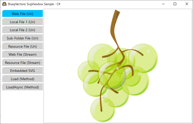
The following XAML codes from the SvgViewboxSample sample illustrates the uses of the SvgViewbox control.
<Window x:Class="SvgViewboxSample.MainWindow"
    xmlns="http://schemas.microsoft.com/winfx/2006/xaml/presentation"
    xmlns:x="http://schemas.microsoft.com/winfx/2006/xaml"
    xmlns:svgc="http://sharpvectors.codeplex.com/svgc/"
    Title="SharpVectors: SvgViewbox Sample - C#"  Height="720" Width="960"
        Background="White" Icon="SvgViewboxSample.ico" WindowStartupLocation="CenterScreen">
    <DockPanel Margin="3">
        <TabControl SelectedIndex="0" OverridesDefaultStyle="False" FontSize="14" TabStripPlacement="Left">
            <TabItem>
                <TabItem.Header>Web File (Uri)</TabItem.Header>
                <TabItem.Content>
                    <!-- 1. Load Web SVG file -->
                    <svgc:SvgViewbox Source="https://dev.w3.org/SVG/tools/svgweb/samples/svg-files/rg1024_green_grapes.svg"/>
                </TabItem.Content>
            </TabItem>
            <TabItem>
                <TabItem.Header>Local File 1 (Uri)</TabItem.Header>
                <TabItem.Content>
                    <!-- 2. Load local SVG file -->
                    <svgc:SvgViewbox Source="../../Test1.svg"/>
                </TabItem.Content>
            </TabItem>
            <TabItem>
                <TabItem.Header>Local File 2 (Uri)</TabItem.Header>
                <TabItem.Content>
                    <!-- 3. Load local SVG file -->
                    <svgc:SvgViewbox Source="../Test2.svg"/>
                </TabItem.Content>
            </TabItem>
            <TabItem>
                <TabItem.Header>Sub-Folder File (Uri)</TabItem.Header>
                <TabItem.Content>
                    <!-- 4. Load local sub-folder SVG file  -->
                    <svgc:SvgViewbox Source="..\SubFolder\Test3.svg"/>
                </TabItem.Content>
            </TabItem>
            <TabItem>
                <TabItem.Header>Resource File (Uri)</TabItem.Header>
                <TabItem.Content>
                    <!-- 5. Load Resource SVG file -->
                    <svgc:SvgViewbox Source="/Resources/Test.svg" Stretch="Uniform"/>
                </TabItem.Content>
            </TabItem>
            <TabItem>
                <TabItem.Header>Web File (Stream)</TabItem.Header>
                <TabItem.Content>
                    <!-- 6. Load Web SVG file (Stream) -->
                    <svgc:SvgViewbox x:Name="webSvgViewbox" HorizontalAlignment="Center" VerticalAlignment="Center"/>
                </TabItem.Content>
            </TabItem>
            <TabItem>
                <TabItem.Header>Resource File (Stream)</TabItem.Header>
                <TabItem.Content>
                    <!-- 7. Load Resource SVG file (Stream) -->
                    <svgc:SvgViewbox x:Name="resourceSvgViewbox" HorizontalAlignment="Center" VerticalAlignment="Center"/>
                </TabItem.Content>
            </TabItem>
            <TabItem>
                <TabItem.Header>Embedded SVG</TabItem.Header>
                <TabItem.Content>
                    <!-- 8. Load local SVG file -->
                    <svgc:SvgViewbox x:Name="embeddedSvgViewbox" HorizontalAlignment="Center" VerticalAlignment="Center">
                        <svgc:SvgViewbox.SvgSource>
                            <![CDATA[
<svg xmlns="http://www.w3.org/2000/svg" viewBox="0 0 100 100">
  <circle fill="#009" r="45" cx="50" cy="50"/>
  <path d="M33,26H78A37,37,0,0,1,33,83V57H59V43H33Z" fill="#FFF"/>
</svg>
                            ]]>
                        </svgc:SvgViewbox.SvgSource>
                    </svgc:SvgViewbox>
                </TabItem.Content>
            </TabItem>
        </TabControl>
    </DockPanel>
</Window>
The image of the SvgCanvasSample sample is shown below: